
 04/10/2016 - Michael Oliver – LIBERTARIANISM, AUSTRIAN ECONOMICS & MOMENTUM STRUCTURAL ANALYSIS – Part II – Analytics
This is the second installment of a two part series in which FRA Co-founder, Gordon T. Long and Michael Oliver, Founder of Momentum Structural Analysis (MSA) break down momentum charts and their unique distinctions in understanding the foundations of Momentum Structural Analysis.
“What we do is we measure means; we do not just lay a moving average on a price chart which doesn’t help at all. One of the great things that momentum analysis does is it finds repetitive market action which can be seen better compared to looking at a price chart. MSA is always focused on the different trends a market might have because markets never have one trend. They may have long term trends which within them consist of counter-cyclical sub-trends which if you’re are not cognizant of can really hurt you. What we try to do with momentum is, since we cannot totally ignore price because it is nonetheless part of the momentum measuring process, we measure price bars in relation to averages of our choice. We oscillate monthly bars in relation to the averages and we get a visual construct of the market once we create the momentum chart which often reveals alarming data.”
 Price is comfortably at the high points and far away from any major pivotal lows but from looking at the momentum chart once you break the structure, the rally that followed confides itself to the underlying side of the violated momentum chart.
“The market was a dead man walking and all it was doing from January to august was bumping his head on something he couldn’t get through and finally he just gave up. “
If you were going into an asset that couldn’t be dumped overnight but you had to have committee meetings etc. annual momentum gave you the warning. It gave you time to reorient yourself to the new reality.
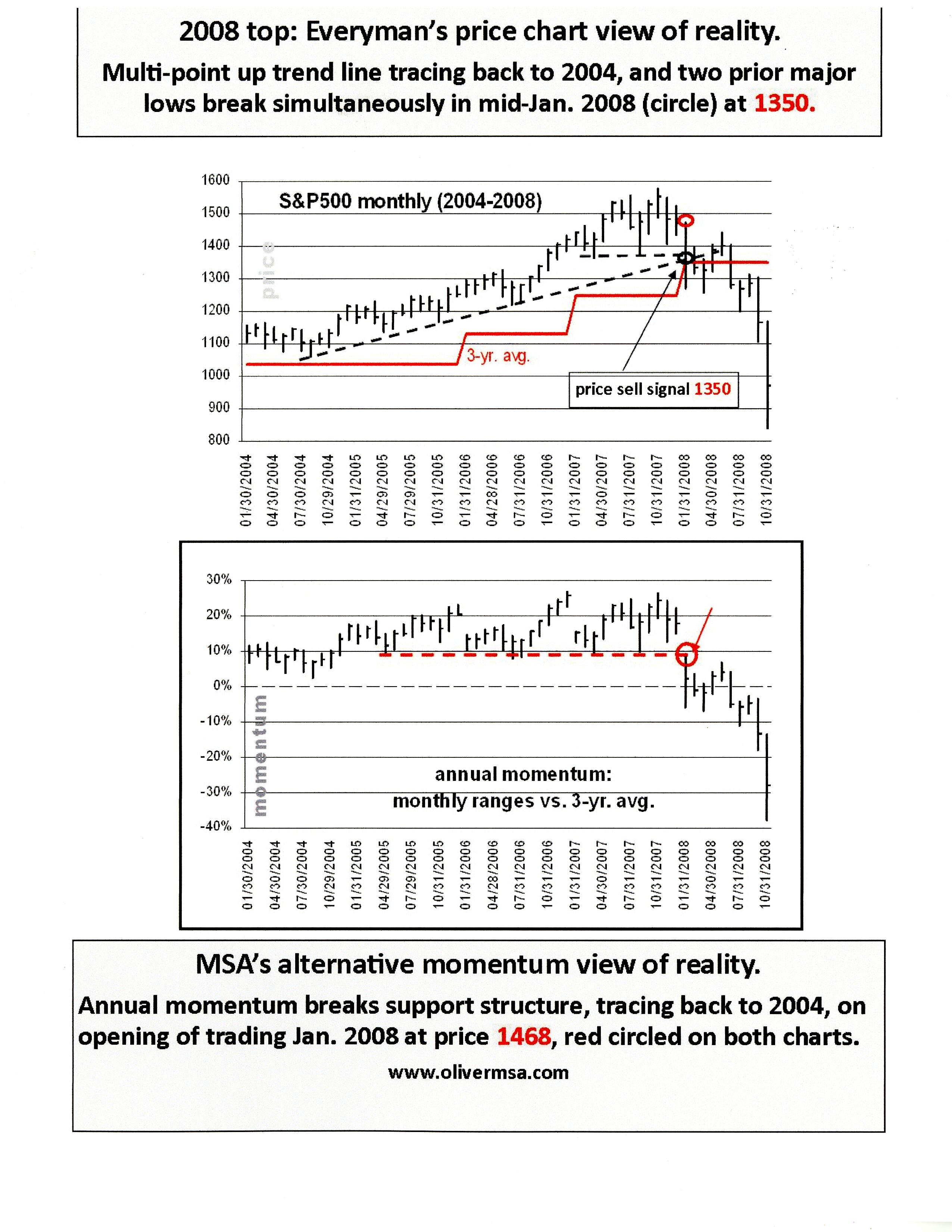
At this point annual momentum had not broken down, so all the activity at point 1500 was lateral action in price and momentum. But from looking at the price chart, you could plot an uptrend line going back to a pivotal low in 2004 and connect it with other lows giving you a good price chart trend line. And still sticking to price, you could draw a horizontal line through the two lows of 2007 which gives you these two lines converging. When you opened in Jan 2008 you were almost 100 points above the low in August, giving you a cushion.
On momentum however, you opened below the flow, so again the situation where the moving average changed and you opened at the wrong place at the wrong time. Even the price chart accommodated the break in annual momentum, but as soon as price lows are removed and you ran stops, the market became ‘oversold.’ This instance leads to a double digit percent rally, the rally is inconsequential to momentum but important to price.
In present case, the rally will likely play around in the upper 2000s, not making a new high. If this rally is similar to the rallies in 2008, which occurred after price came down and joined momentum, took out previous price lows and made the picture very clear that you’re in a bear market.
“It is a fact you have to live with; tops especially in stocks are tough to catch.”
Gold is up 17% in the year thus far and this shift is quite significant when you put it on a momentum chart based on spreads. When you plot all these variables together, I predict many seismic shifts to occur, and not just stock declines, but upturns in gold as well.
“Right now I believe we are in a bear market and this is a bear market rally. It is also important to not just look at a market; you have to look at things that are inverse or related to it. I would therefore look at gold and commodities in their relationship to the S&P.”
Many price chart advocates would look at gold and say you’re having problems from being against a channel top, but on the contrary momentum says that same channel tops will be transitory.
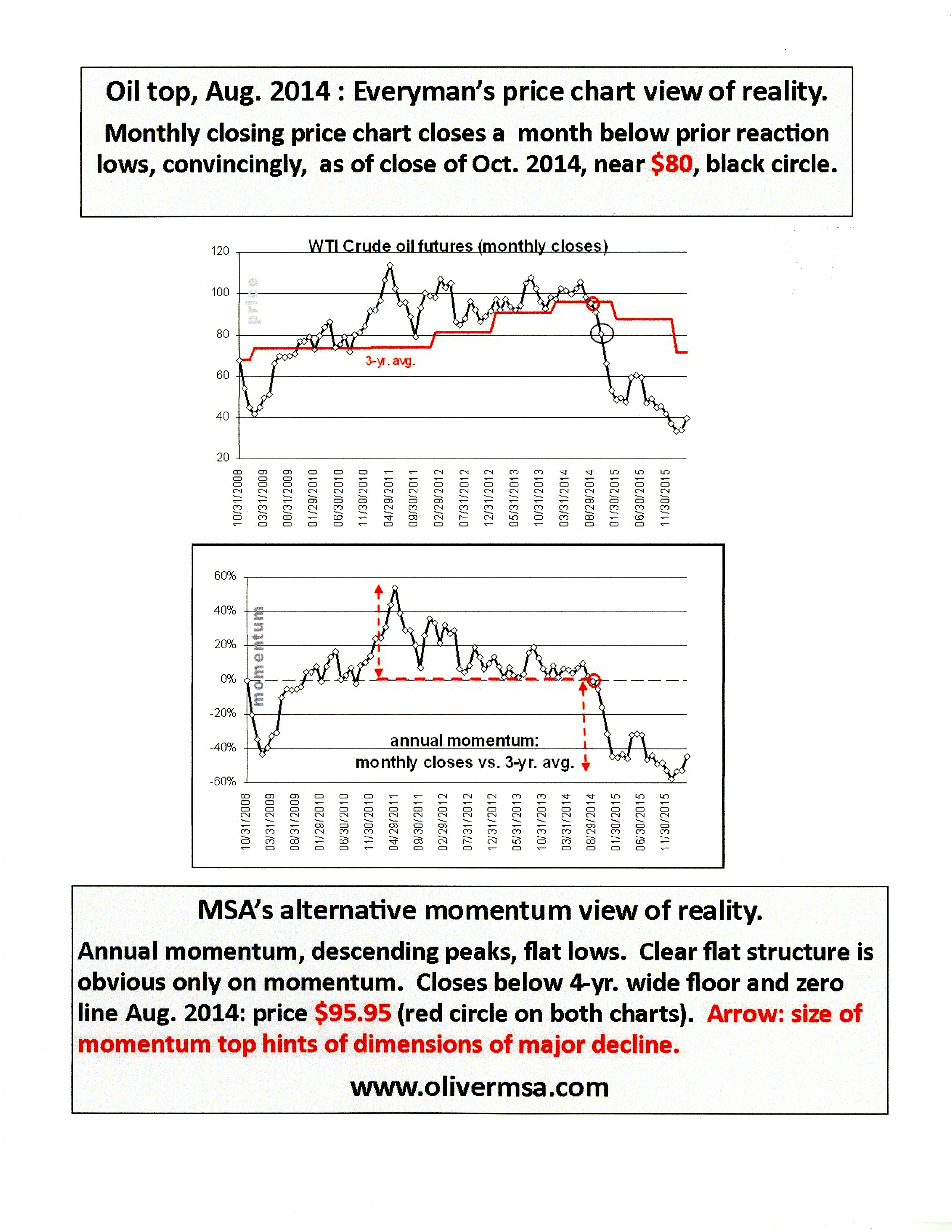
“If oil collapsed in 2012 versus when it really did in 2014, it would have severely damaged the stock market, particularly the S&P. Oil waited until the latter part of 2014 which is the same time the S&P began going sideways and which is also where we are now. In effect, by oil holding off, it held back its need to replenish.”
From looking at the price chart you see a sideways action of sorts, but you can interpret it as a price chart advocate as a basing action preceding another leg up, the lows were rising more rapidly than the highs. Then coming down in the late summer, you managed to close below the 3 year moving average. This average was important because in the years prior to 2014, there were a few pullbacks to this average which held throughout. When you convert this to the momentum chart, it shows a descending pattern.
Now what is going on in oil is that you’re building a base. It is possible the low that was made last month as well as the addition of the rally is a setup for a potential final low. When you look at quarterly momentum you see a major pending upside breakout. From looking at the momentum chart you would be shocked. But for this to happen you have to firstly finish the downside, and once that happens and oil closes at any month in the current quarter at $41.20 or higher then you have broken out of quarterly momentum leading me to believe oil will go to roughly $60.
“Now what I am looking at is lesser time scales, even weeklies and trying to find a credible downturn that indicates the rally is over.”

In 2011 people were very comfortable in believing gold was in a congestion zone. For the next year it teetered sideways, and was rationalized to be the next leg for the upside. The problem was that in January you have this price drop from late 2011 to a low in 2012. But when you came down in January, it didn’t do any damage to the price chart but it created an uptrend line on the annual momentum chart and it also took out a major previous low on gold. After this there was a mass amount of time where price didn’t break down, it oscillated until finally in 2013 momentum broke down in a decaying pattern.
Ever since the summer lows in 2013, gold has gently oscillated downwards but also came above that level repeatedly, so we can interpret this level as a midpoint. But during the decline in gold in 2013, most people were looking for collapses but we were not.
Looking at the momentum chart you see a different picture, you see horizontal action. The point at which momentum broke through that base was when price reached 1140-1160, a level well below the current market.
“I think gold has broken out on annual and quarterly momentum; it has paid its dues and I’m getting secondary evidence from foreign exchange. I believe now is a time to be long gold stocks more than gold.”
Abstract written by, Karan Singh Karan1.singh@ryerson.ca
Video Editor: Sarah Tung sarah.tung@ryerson.ca